The NY Times neatly reported on the use of Nobel Prize winning gaming theory in the perennial problem of matching New York's high school students with the school of their choice. Since all 75,000 NYC Middle-school students have the option of attending any of the 426 NYC schools and there are many over-achievers, a simple priority list like the college acceptance process used to result in many unhappy applicants.
So a group of professors got together and modified a gaming theory called "The Stable Marriage" for this purpose. In the early 1960s, the economists David Gale and Lloyd Shapley proved that it was theoretically possible to pair an unlimited number of men and women in stable marriages according to their preferences.
By running a series of rounds of proposals and acceptances with tentative acceptance sometimes being trumped by a rejection and acceptance of another suitor, all the men and women get matched up with someone within their range of preferences.
Below is a nice graphic showing the process simplified to ten students, three schools, each of which have three slots, three preferences and three rounds. In reality there are more of each variable but, with computerization, the process works the same.
In 2003, New York City changed its method for matching eighth graders to high schools with a system, called a deferred acceptance algorithm, that was designed by a team of professors, including one who later won a Nobel prize in economic science. The key feature was mutuality: Students submit a list of preferred schools in order, and schools prepare an ordered list of students whom they want or who meet their standards. After rounds of computer matching, schools and students are paired so that students get their highest-ranked school that also wants them. Here, in simplified form, is how it works. In this example, each school can take three students, although it can list more, and each student can list up to three choices.
 |
| Sources: Academic papers, with assistance from Parag Pathak, Massachusetts Insitute of Technology
By Ford Fessenden
|
Showing posts with label Graphics. Show all posts
Showing posts with label Graphics. Show all posts
Friday, December 5, 2014
Gaming theory helps place NYC Students in school of choice
Sunday, October 19, 2014
Quarterback Graphic
The New York Times graphic department scored with this beautiful graphic showing touchdown passes plotted against year for 252 quarterbacks.

With 252 quarterbacks and their touchdown passes shown each year of their career, this stunning graphic has over 2000 pieces of data elegantly displayed. The top quarterbacks and the current crop have their curves labeled. By looking at the slope of the curve, one can see which quarterback is most efficient while the height shows the record holders. You can compare quarterback efficiency and production over the decades all the way back to Benny Friedman in the 1930's.
Get access to the full article here.
Wednesday, April 23, 2014
Nice graphic showing income disparity
The Times graphic department did another great job, showing a lot of data in a clever way. How have American's incomes increased (or decreased) over thirty years by percentile compared with other countries. I'll let the graphic speak for itself:
 Pretty cool, huh. If you want to read the article, click here.
Wednesday, December 4, 2013
College football conference graphic
Here's another great graphic and one I want to post so I can have access to it when I need it. It shows the shifting conferences that college football teams have experienced lately. The picture is pretty small but this link gets you to the web page from the NY Times that allows you to interactively highlight any team and see where it went. great job Times!


Saturday, February 23, 2013
Are US workers spending too much time on the job?
Far be it for me to recommend US workers emulate the French who work 30 hours a week and have annual 17 week vacations but perhaps we are working too hard. The following two graphs from a recent New York Times article put things into perspective for me.
Why are we one of only eight countries that don't offer paid maternity leave? Being in the same club as Suriname and Liberia doesn't speak well for this country.
And our work week hasn't dropped much along with the prosperity brought by the second half of the 20th century. Even the Japanese are working less than we are.

Why are we one of only eight countries that don't offer paid maternity leave? Being in the same club as Suriname and Liberia doesn't speak well for this country.
 |
| Recent NY Times article |
And our work week hasn't dropped much along with the prosperity brought by the second half of the 20th century. Even the Japanese are working less than we are.

Thursday, January 10, 2013
Leadership on Social Security
We've all heard about the time-bomb called Social Security. When all the baby-boomers are retired, there won't be enough Generation X and Y people paying taxes to cover their Social Security payments. We've seen the issue come up again and again but nobody seems to want to deal with the issue. Because older people vote in high percentages it is a political hot potato that leaders prefer to ignore and hope their successor will deal with.
A recent article in the Times shed some interesting light on the issue that I wasn't aware of. The government's forecasting methods have barely changed since the program was set up in 1935! Their actuarial tables are significantly different from reality. The Times did a great job exposing some of these errors. I'll try to summarize for you some of the more egregious ones.
How about the number of smokers? Do you think that might have changed since 1935? You bet it has which means what? People are living longer. Of course some of that gain is reversed by increasing obesity though the link between that and lifespan is being questioned lately.
 The study the Times conducted showed weirder results. Like the stoke graph below where the projections going into the future have different curves so that the lines cross when they shouldn't.


A recent article in the Times shed some interesting light on the issue that I wasn't aware of. The government's forecasting methods have barely changed since the program was set up in 1935! Their actuarial tables are significantly different from reality. The Times did a great job exposing some of these errors. I'll try to summarize for you some of the more egregious ones.
How about the number of smokers? Do you think that might have changed since 1935? You bet it has which means what? People are living longer. Of course some of that gain is reversed by increasing obesity though the link between that and lifespan is being questioned lately.


The data becomes more ridiculous when you add up the deaths from all causes to end up with death rate charts. Look at this one where everyone who is between the ages of 55 and 59 will die in 2028. What's this, the Incan calendar end date?

So, come on Obama. I understand why you wanted to avoid the political hot potato but how about getting someone within the administration to look at the data and statistics behind these models and get them up to date and accurate. If insurance companies can do it, so can the Social Security Administration.
Great graphics by the way NY Times!
Wednesday, December 19, 2012
Time for leadership on shooting deaths

This time it was a Connecticut elementary school. What's next? I'm getting tired of people shaking their heads and not knowing what to do. Why? Is it the number of guns we Americans own? While we rank number one in the world for gun ownership at around 90 guns per hundred people, there is no correlation between number of guns and number of homicides. The Serbians and Swiss have half as many guns but a fifth the suicides. The Jamaicans have one tenth the guns and fifteen times the homicides.
I looked at the statistics on gun ownership and homicides and split it up many ways. It became rapidly clear that we are not like a European nation. In most European nations the ratio between gun ownership per hundred people and homicides per 100,000 is around 100: 1.
We have more in common with Latin American nations in this ratio of about 30:1. (A lower number is worse) Chile was a remarkable exception to this region with a ratio of 176:1.
But this regional breakdown wasn't helping much. It did seem to highlight the areas with the lowest ratios and it seemed like these were all areas where automatic weapons are readily available.

So the answer seemed obvious. It's the access to automatic weapons. There are whack jobs in other countries who try mass murder but with knives, like in China, they are just not that efficient. The same day as Sandy Hook, the latest madman in China stabbed 22 schoolchildren but only seven were admitted into a hospital and none were seriously injured. With an automatic weapon followed by Glock handguns and special ammunition, there was only one wounded survivor in Connecticut.
Why do we allow so many guns to be available in this country? I can understand rifles and shotguns for hunting but handguns and automatic weapons are designed for one thing: killing people.
Simple answer right? But then, being the good engineer, I started to look at the statistics. I plotted 'Gun Freedom Index' versus my ratio, expecting to find a nice correlation.
Here's what I found instead:
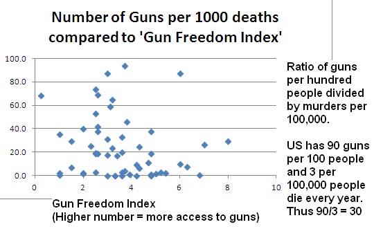
Rats! Looks like a completely random scattergram. I found that extremely repressive governments have low homicide rates but who wants to live in China or Qaddafi-led Libya? (Wow! I sound like an NRA backer now)
I'd like our homicide rates to drop to those in Northern Europe. Of course you still whackos there killing off Prime Ministers and camping socialists but the overall number is a tenth as high as here.
It seems like some smarter people than I need to look into this seriously, find the cause and bring this country up to those standards.
But let's start by not publishing the names of these killers. The New York Times just listed the top shootings in America like it was a roll of honor with a column dedicated to the killers. There are enough crazies out there who'd like to get on that list. Let's not give them any more incentive. For the same reason, why do we know the first, last AND MIDDLE names of all the Presidential assassins? Let's keep them listed as shameful killers, nothing more.
Wednesday, November 14, 2012
With all the data generated in the recent US election, some very clever people found ways to use them to explain what America tis thinking.
This graph was awesome on a full-page spread of the paper, it's not as impressive in the blog but here's a link to the data. It shows that in most counties there was a shift to the right, shown by a red arrow, but this was not enough to deny Obama re-election.

Here's a link to a graphic that shows the lessening of support Obama received from various groups.
 In this link we see how the youth vote helped in the swing states.

This graph was awesome on a full-page spread of the paper, it's not as impressive in the blog but here's a link to the data. It shows that in most counties there was a shift to the right, shown by a red arrow, but this was not enough to deny Obama re-election.

Here's a link to a graphic that shows the lessening of support Obama received from various groups.


Friday, November 9, 2012
Hurricane Photos
Between Google's satellite photos and NOAA's aerial photos and some clever matching, we now have the ability to scroll over before and after pictures of this recent hurricane damage in New York, New Jersey. I show some stills below but encourage you to use this link to get to the photos that you can scroll between. Sobering indeed.
 |
| Mantaloking beach where Mother Nature made it's own changes to this barrier island. |
 |
| Breezy-Point section of Rockaway beach, where 111 homes burned as firefighters were kept away by floodwaters |
Tuesday, October 23, 2012
Awesome food label
I love a good graphic and there was a wonderful article in a recent NY Times showing the author's proposed food label.


Featuring red, yellow, green and big numbers, these labels would be obvious to all consumers the relative healthiness of the foods they were buying.
Here's how it works for four imaginary foods:


Now isn't this a lot more understandable than the horrible labels we currently have?

Really, who even reads these anymore?
Friday, September 21, 2012
Auto death chart

If you can't read it above, jump to the article and see the details. Fascinating!
Wednesday, March 14, 2012
Dignity for the dead
 |
Hiroko Masuike/The New York Times
Atsushi Chiba used Buddhist rituals in caring for nearly 1,000 bodies in Kamaishi. “It's a way to comfort the living,” he said.
|
One undertaker, Atsushi Chiba cared for almost 1,000 bodies in Kamaishi. Mr. Chiba, in his early 70s, raced to the temporary morgue on the day after the tsunami to look for friends and family, but was struck by the state of the mounting number of bodies there. Most were still clad in muddy clothes and wrapped in plastic, their rigid limbs jutting out and faces bruised by debris and contorted in agony.
“I thought that if the bodies were left this way, the families who came to claim them wouldn’t be able to bear it,” Mr. Chiba said Thursday in an interview. “Yes, they are dead. But in Japan, we treat the dead with respect, as if they are still alive. It’s a way to comfort the living.”
Mr. Chiba set to work. He became a fixture at the morgue, speaking to the bodies as he prepared them for viewing and then cremation. “You must be so cold and lonely, but your family is going to come for you soon so you’d better think of what you’re going to say to them when they arrive,” he recalled saying.
He also taught city workers at the morgue how to soothe limbs tense with rigor mortis, getting down on his knees and gently massaging them so the bodies looked less contorted. When the relatives of a middle-aged victim sobbed that her corpse looked gaunt, Mr. Chiba asked for some makeup and applied rouge and blush.
Mr. Chiba’s attempts to honor the dead quickly caught on. City workers put together old school desks to make a Buddhist altar. They lay the bodies of couples and of family members together. Each time a body was carried out, workers lined up with heads bowed to pay their last respects.
And at Mr. Chiba’s urging, Kamaishi became one of the only hard-hit communities to cremate all of its dead as called for by Japanese custom, enlisting the help of crematoriums as far as Akita, over 100 miles away.
In all, 888 of Kamaishi’s approximately 40,000 residents are known to have died; 158 more are listed as missing and presumed dead.
The priest, Enou Shibasaki, from the Senjuin Temple in the hills overlooking Kamaishi, remembers the change that came over the makeshift morgue as Mr. Chiba and other city workers tended to the bodies.
“Whether you are religious or not, mourning for the dead is a fundamental need,” Mr. Shibasaki said. “Mourning starts by taking care of the body. It’s the last you see of your loved one, and you want to remember them as beautiful as they were in life.”
Read the details of this story in a recent NY Times article
Here's a great slideshow with the faces of the tsunami:

If you were impressed with the graphics put together showing the before and after photos of the destruction caused by the tsunami,

this next graphic shows the progress that has been made repairing the damage. Click on this link to see.
Sunday, February 12, 2012
We are drowning in debt
 |
| Great graphic from NY Times January 22 |
Have the last two presidents led our country forward or backward?
Tuesday, December 27, 2011
Banner-making machine

A vending machine that allows you to create your own banners sits at Schipol airport in Amsterdam just waiting for you to type in a greeting. You choose the size and design and the machine will print it out for you in less than three minutes.


Read more about this project in this NY Times article.
Thursday, December 1, 2011
Awesome graphic from the Times
I love it when the Times posts a great graphic. This one shows the effects of various wars, dictators, failed states and institutional oppression on world population. The graphic uses Tufte's principals of letting the data do the talking so I'll do the same. I'll present the graphic and let you see in it whatever you wish. To see it better, click on the hyperlink above. (Times)
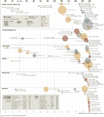 What did I see? Whenever a population gets too big, there are wars, despots and famines that take care of this. Most of the big cuts in population took place in China. Oh, and things are definitely getting worse, the bigger the world population gets.

Friday, May 20, 2011
Program Management at Delta/Northwest
Wow! For a Project Manager, seeing a full-color picture of this in the paper is a treat indeed.
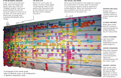
The challenge, she said, was to switch the systems progressively so that passengers would not notice. Ms. Wise, who has a doctorate in applied mathematics, devised a low-tech solution: she set up a timeline of the steps that had to be performed by pinning colored Post-it notes on the wall of a conference room.
A major switch happened when the new airline canceled all Northwest’s bookings and transferred them to newly created Delta flights in January 2010. It required computer engineers to perform 8,856 separate steps stretched out over several days.
One other issue has apparently stumped everyone. Delta and Northwest each used different trash bags in their cabins. Northwest’s was large, held up better and was easy to use. Delta’s was smaller, like a high-end shopping bag. The airline is still working on finding the perfect bag.
“The amount of work is boring beyond belief,” Mr. Wilander said. “It is also critical to the airline.”

What was it? At first I thought it was a Work Breakdown Structure, but then I saw the swim lanes and thought it was a Process Map. Then I read the article and realized that this was a Program Management Plan. Each one of those stickies represented a project that together, resulted in the program to merge two airline.
Turns out, the effort to merge two airlines is huge. From cultural changes like ringing two or four times on landing to the pilot contracts, there were millions of tasks.
From the Times article: Delta’s chief information officer, Theresa Wise, said the airline had to merge 1,199 computer systems down to about 600, including one — a component within the airline’s reservation system — dating from 1966.
A major switch happened when the new airline canceled all Northwest’s bookings and transferred them to newly created Delta flights in January 2010. It required computer engineers to perform 8,856 separate steps stretched out over several days.
One other issue has apparently stumped everyone. Delta and Northwest each used different trash bags in their cabins. Northwest’s was large, held up better and was easy to use. Delta’s was smaller, like a high-end shopping bag. The airline is still working on finding the perfect bag.
“The amount of work is boring beyond belief,” Mr. Wilander said. “It is also critical to the airline.”
Friday, March 18, 2011
Impressive Graphics of Tsunami Damage
This post doesn't speak much about Project Management but I wanted to share with you the very impressive graphics that the NY Times has put out showing damage by the recent tsunami. Click on the link below, then grab the scroll bar in the middle of the screen and move it left and right to see how each area was affected.
Subscribe to:
Posts (Atom)